Easy Invoice
An invoicing app for freelancers and sole traders to manage clients and payments simply.
March 2026
- Role
- Product Designer
- Context
- Personal Project
- Focus
- Simplicity & Automation
- Tools
- Figma & Claude Code
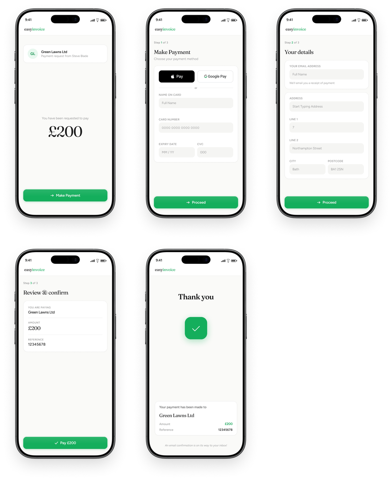
- ✓Secure Payments
- ✓Simple Customer Flow
- ✓Clear Notification back to Payee
01 — The Problem
Spreadsheets, Paper, and the Awkward Money Chat
The "Chase" Fatigue: Freelancers and small business owners often feel like "nags" when following up on unpaid invoices. This creates emotional stress and delays essential cash flow, as they lack a professional, automated way to remind clients of upcoming or overdue payments without damaging the client relationship.
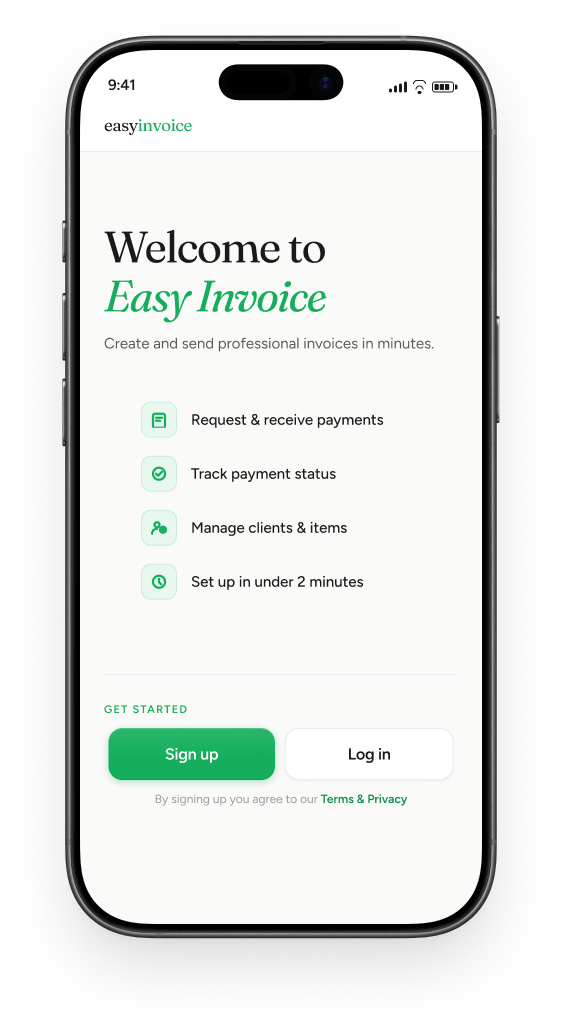
The Admin "Gap": Many business owners wait until the end of the month to handle billing because current tools are too complex or desktop-oriented. This "delayed invoicing" leads to forgotten billable hours and lost revenue, as the friction of requesting payment in the moment—especially for those with busy schedules or accessibility needs—is too high.
02 — The Solution
Simple, Frictionless Tracking and Automated Reminders
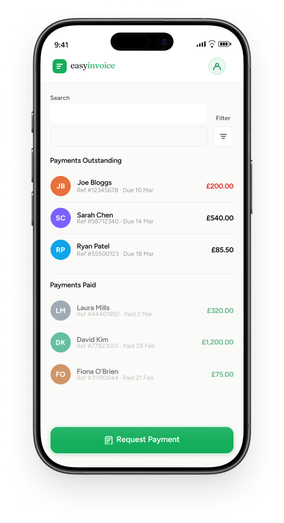
To provide users with real-time visibility into the status of their payments (e.g., "Sent," "Viewed," "Paid") and automate the follow-up process. The goal is to eliminate the manual "checking and chasing" work, giving the business owner back at least 2–3 hours of administrative time per week.
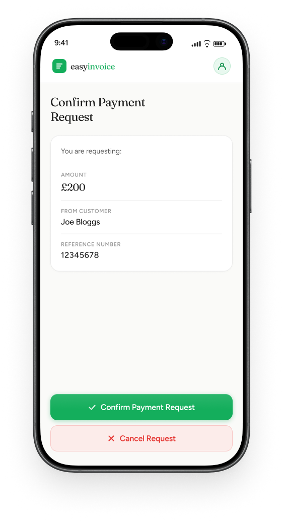
The idea was simple. Enable the user to send the customer a payment request when the job has been completed. The app automatically logs when that request was sent and sets up automatic reminders if the payment request remains unpaid.
User Flow
Payment request
Enter details
- 1Client name
- 2Reference number
- 3Payment amount
If unpaid, automatic reminders
Reminder sent
Reminder sent
Final reminder sent
Customer pays
Reminders stop
User Flow
Payment request
Enter details
- 1Client name
- 2Reference number
- 3Payment amount
If unpaid, automatic reminders
Reminder sent
Reminder sent
Final reminder sent
Customer pays
Reminders stop
03 — How I Got There
Testing with the Trio and Visual Reality Checks
I tested with three people - a freelance photographer, a self employed electrician and a designer. All 3 liked the initial designs but were adamant that the interface needed to be clear and agreed that the payment requests needed to be shown clearly in the app in two simple states - Paid (in green) and Unpaid (in red).
One of the more elderly testers also made the point that when something happened it needed to be really clear - hence the big ticks after a confirmation screen.
04 — Next Steps
Points for Further Development
- —A system to manage clients within the app.
- —Simplifying the information architecture, particularly on the menu.
- —Build out the interface to allow clients to agree costs before work starts, creating a 'pre-work agreement'.